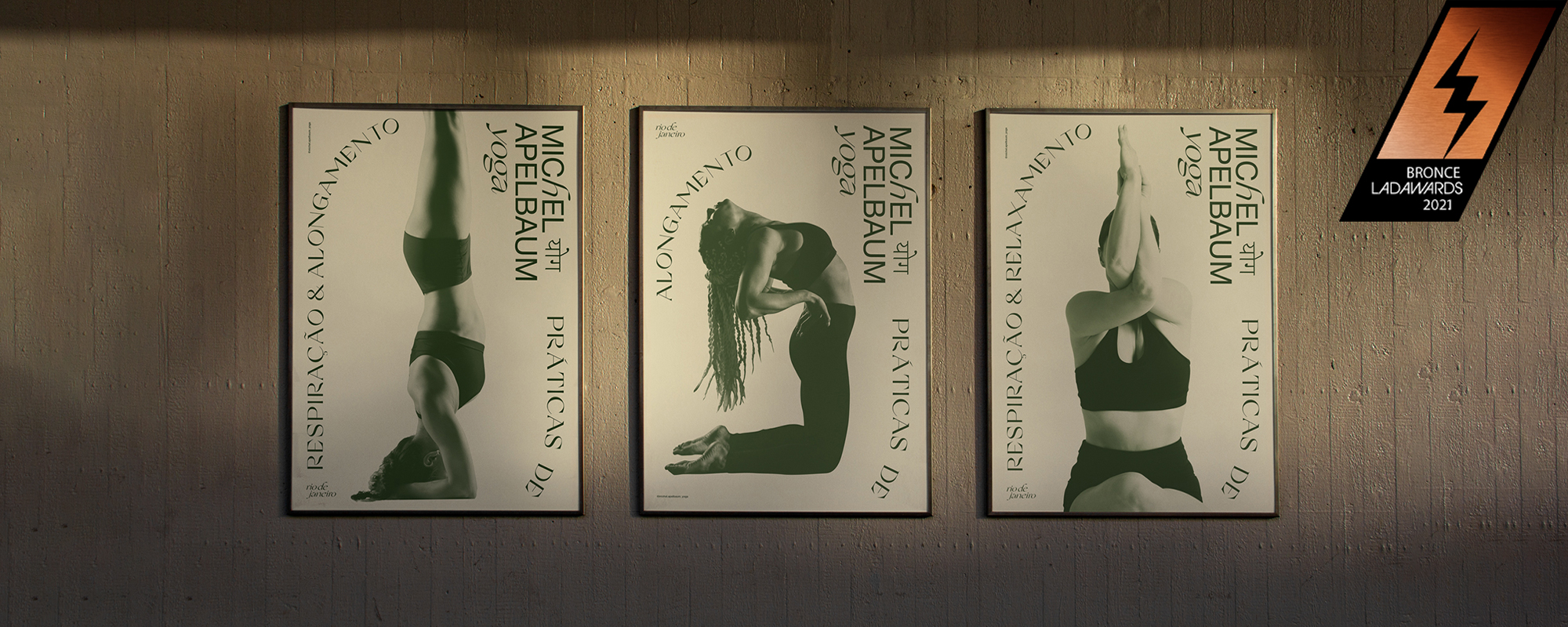
Michel Yoga
Visual Identity, Branding
Michel is a young Brazilian yoga teacher who desired to have a professional identity. This project was developed upon the definition of some parameters, such as movement, harmony, personality, reliability and contemporaneity.
We worked to create something that not only translated these concepts, but that was also coherent with the yoga culture, taking in consideration and respecting its historical, religious and cultural contexts.
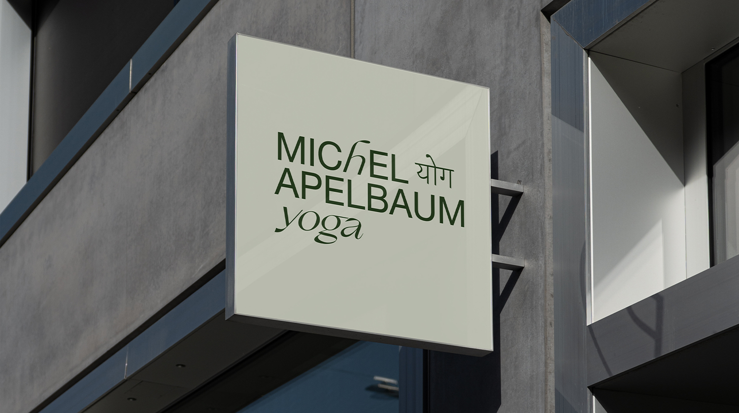
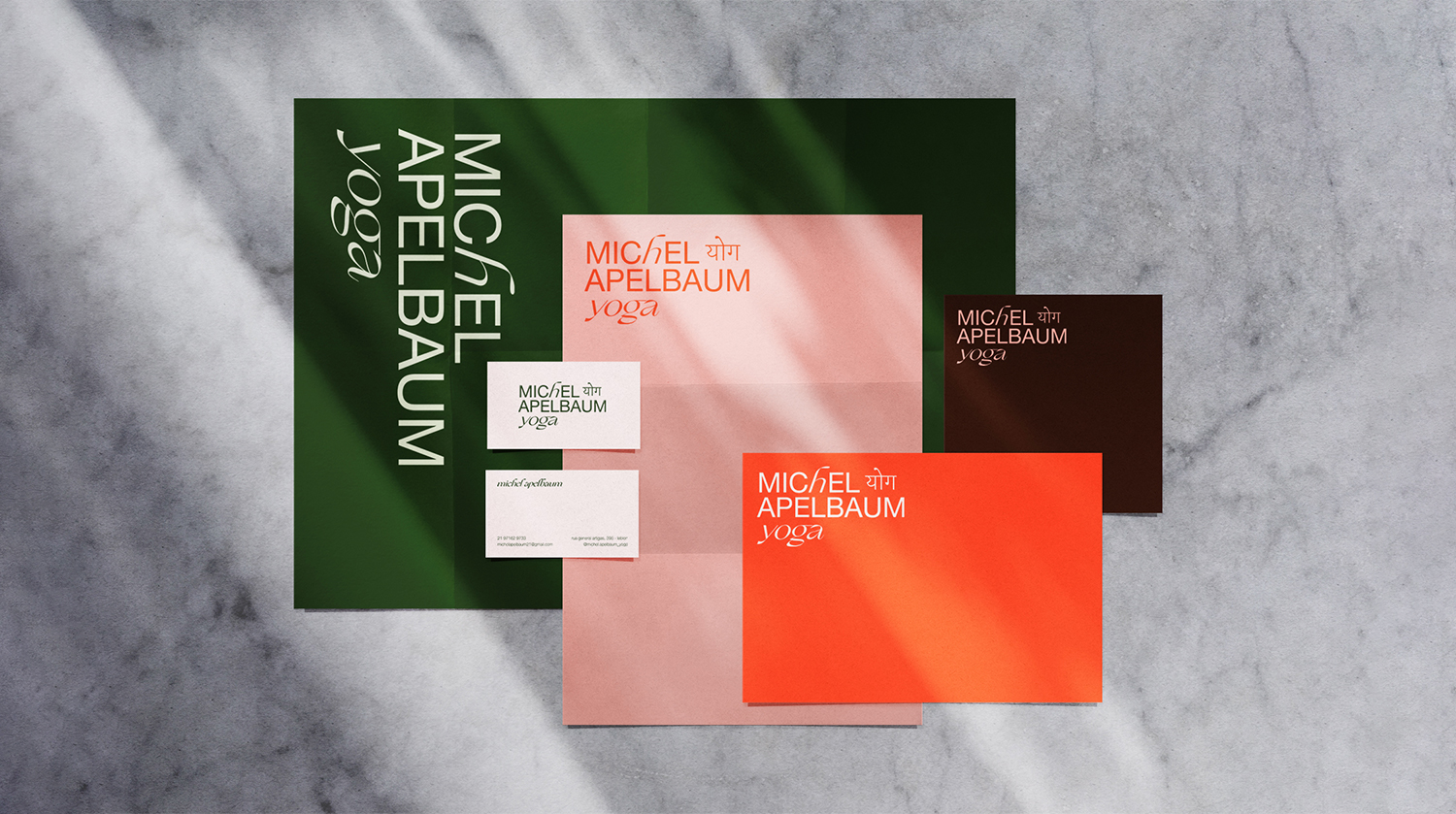
As we dove into a different culture, we were able to comprehend its historical context and particularities. Understanding these aspects was crucial to the decisions we made throughout the project. The solution created for the brand’s signature came through a typographic analysis of the latin typography and the devanágari alphabet, thus representing the marriage between the two cultures. Therefore we opted to maintain the word “yoga” in its original form (sanskrit).
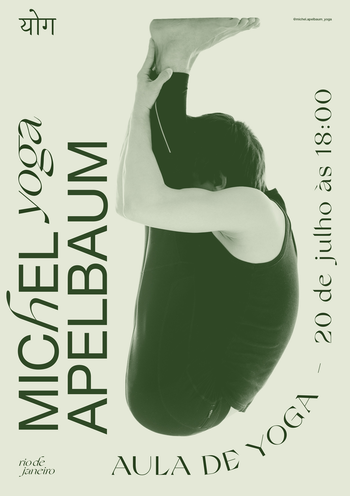
The visual language was inspired by the temples and meditation sites found in India, contemplating its colors and architectonical aspects. As a result, we have a modern brand, harmonic and consistent to a yoga teacher that is young and mature.




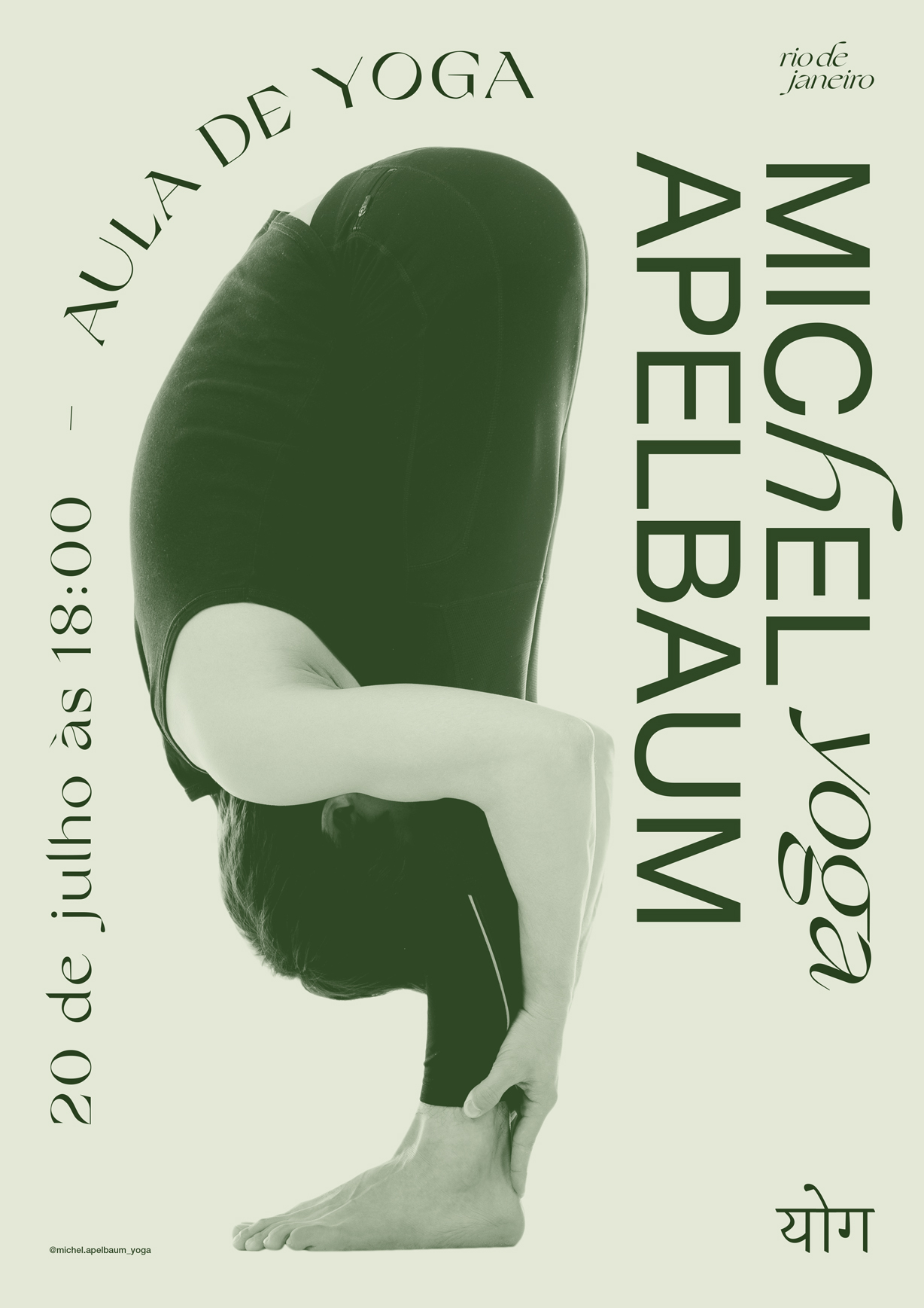
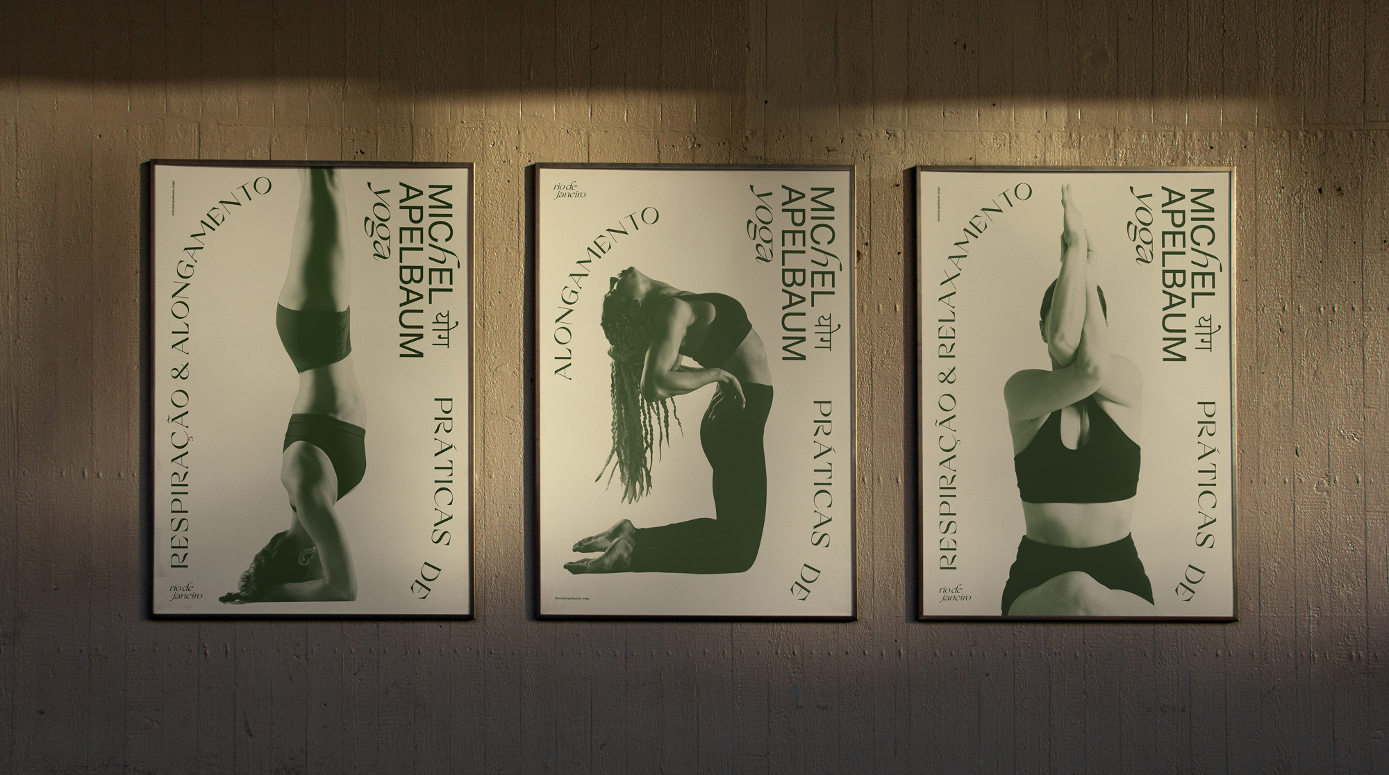
Direção Criativa: Thiago Balassiano e Giovana Malka
You may also like some
more projects
Project / Client
Categories
App Store Japan
Concept, Campaign, Visual Identity
2025
ARQBR
Visual Identity, Website
2024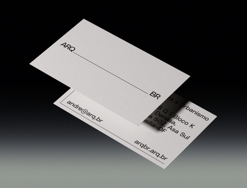
The Invincibles
Campaign, Visual Identity
2023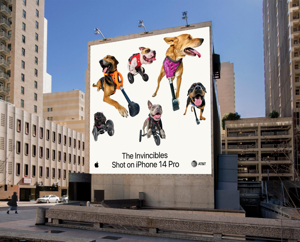
Zerezes Bold
Visual Identity, Campaign
2022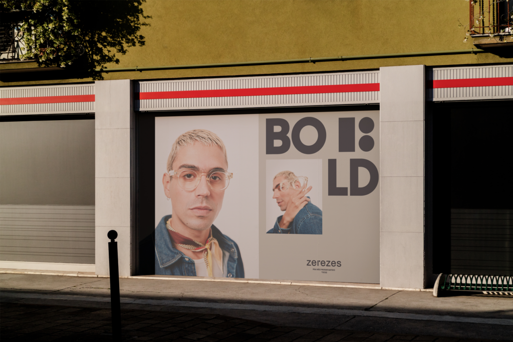
Zerezes Stahl
Visual Identity, Campaign
2022
Vaique
Art Direction, Visual Identity
2022
Discoterra
Logomarca, Illustration
2022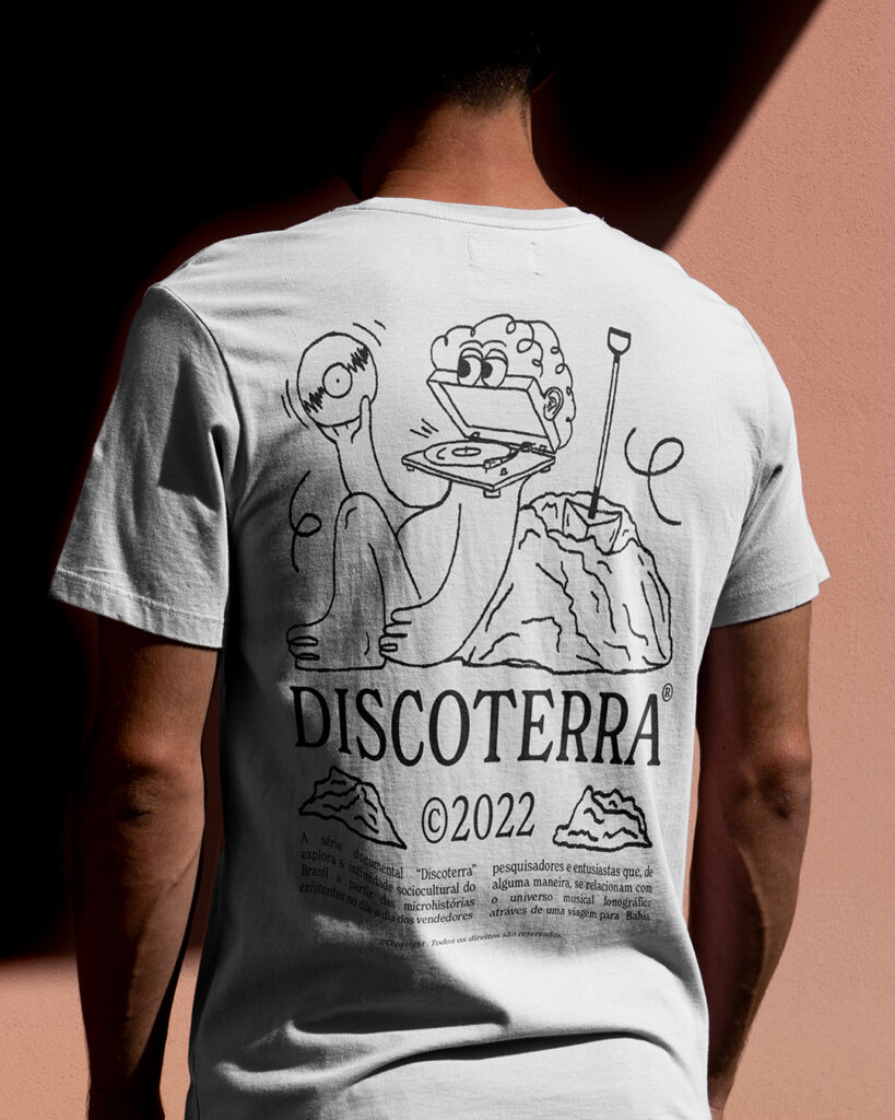
Sunny Flowers
Ilustração
2023
Revide!
Visual Identity, Signage
2022
Eana Cerâmica
Visual Identity, Illustration
2021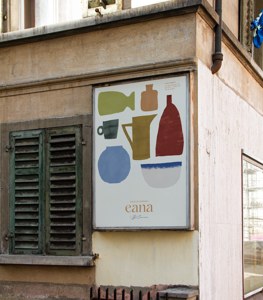
Pici Jazz Festival
Visual Identity, Signage
2022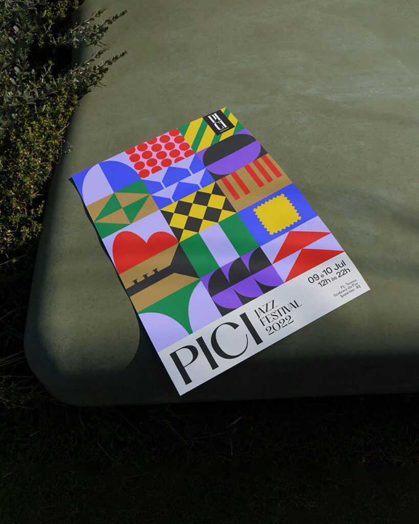
Farm Global
Visual Identity, Presentation
2022
Tas Jazz
Visual Identity, Poster
2022
Melissa (Extra)ordinária
Fotomontagem, Campaign
2022